We fired the soda kiln for the first time this semester, “we” meaning Chris, Sabina, Rey, Ashleigh, Teal, and me. I decided to use both a sprayed solution as well as packets of dry mix as a delivery method for the soda. I wanted to clearly see the difference between the two delivery methods, so we only used this method in one port of the kiln. The solution consisted of 2 lbs of soda ash per gallon of hot water. For the packets, I wrapped a mixture of soda ash, sodium bicarbonate (baking soda,) calcium carbonate, sawdust, and water in newspaper.
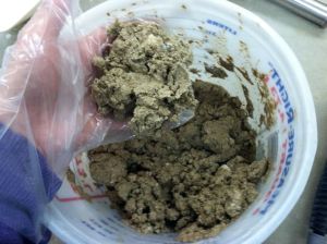
The “plaster method” A paste mixed from calcium carbonate, sodium bicarbonate, soda ash, sawdust, and water

rolling the mixture into little packets
We loaded the kiln after class (and late into the night) on Wednesday, September 11th. The first attempt at firing ended just after 5 am on Thursday, when the kiln was around 1000 degrees. I had peered into the top spy to find that the cone pack had fallen. Not only would a fallen cone pack hinder my ability to judge temperature inside the kiln, but it would also eventually melt onto either the shelves or somebody’s pieces, depending on how far the debris had scattered.
So we shut the kiln down and waited for a moment in our busy schedules when we could dismantle and rebuild the wall. That day ended up being Tuesday, September 17th, firing into Wednesday the eighteenth. We lit the pilots on the newly bricked kiln at 8 pm on Tuesday. The kiln fired slowly and we didn’t introduce soda into the kiln until 8 pm on Wednesday. Although this seems a normal firing time for this kiln (at least, that’s how long it has taken in the past,) I hope to cut the next cone ten firing time by a couple hours.
The kiln went through some heavy body reduction, causing it to soot, blackening the bricks above any spies, ports, or cracks.
Everybody took his or her turn spraying soda solution into the kiln. We began this when cone nine was down on the bottom and soft on the top. Last time, we’d had some trouble with the sprayer tube clogging due to the soda solution cooling, which has the effect of lowering the saturation point of the water, resulting in the formation of chunks that lodge themselves in the tube. We fought this by keeping the sprayer reservoir in a tub of hot water. This time, no clogs. Good thing too, because we didn’t have a turkey baster on hand.

Me, spraying soda solution into a port
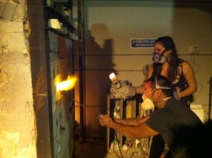
Rey takes a turn

Chris gives it a go
In all, the soda introduction lasted about an hour. We shut the kiln down at 10:30 pm, with cone ten soft on top and cone eleven soft on the bottom.
Oh yeah, and we took a little break for some salsa dancing in between sprays.

Chris gives us a little instruction on salsa. Ashleigh’s got it down!
Unloading didn’t take place until five days later, after Chris, Sabina, and I returned from our trip to Maine (more on that later.) Most of us were very happy with our results. The heavy reduction created some interesting variations of soft grays on some of the bare clay yet wasn’t so heavy as to burn out the copper reds. The kiln was not tightly packed, but evenly distributed for the most part.
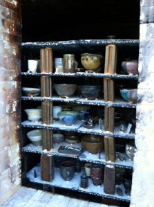
the kiln right before we tore it apart

most of my pieces
Later, I’ll post more on some of my test results. I had some exciting clay body tests and a couple interesting glaze tests. But for now, I’ll simply comment on a few conclusions reached from this first firing:
The packets seem to be the least desirable method of soda introduction. They are more clumsy to add and don’t fully combust upon entry. If they are used in the future, they should only be introduced through low ports, behind the bagwall, so that they don’t make a mess of the shelves. Spraying is an easy, relatively clean method in comparison.
Next time we will pack the kiln more tightly in an attempt to evenly distribute heat, pressure, and soda. And also, maybe a little lighter on the reduction. All in all, a fine first firing with a fun crew!


